7 Ecommerce Website Design Examples
Let’s examine a few examples of our B2C ecommerce clients.
1. Larq
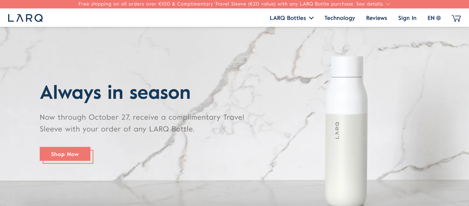
LARQ uses crisp product images and animations to make us truly excited about something as simple as drinking water. Through spot-on copywriting, color-block product features, and interactive plastic waste calculator, the reusable water bottle retailer persuades us to join their Bottle Movement and explore more of their stylish products.
Adding multi-regional capabilities was another pivotal moment. According to LARQ, within 3 months, their conversions increased by 80%.
2. Burrow
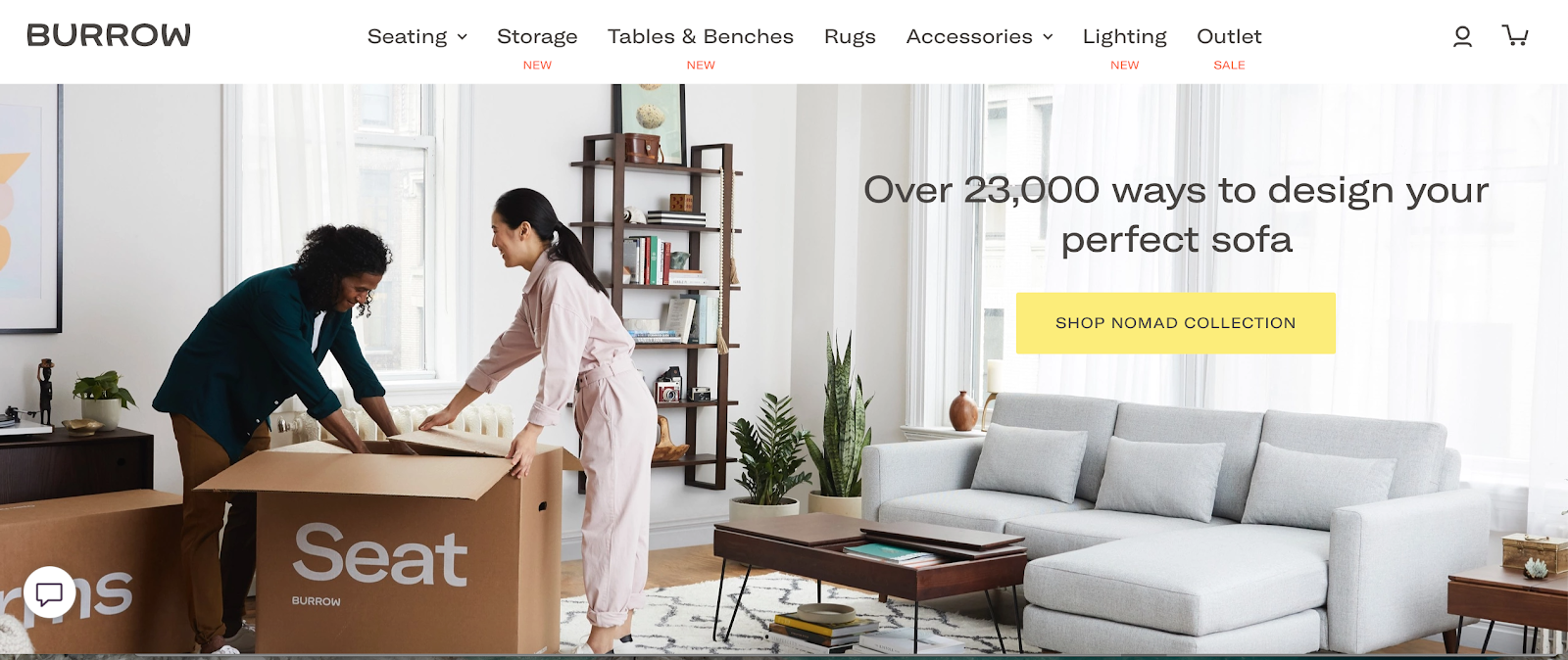
Modular furniture retailer Burrow, skipped words in favor of a home page video to demonstrate their main value proposition — assembling new furniture can be fun, quick, and tool-less. Using a mix of product and lifestyle pics, Burrow makes it easy to picture their latest designs in your home, customize them for the right fit, and order in several clicks.
3. Revelry
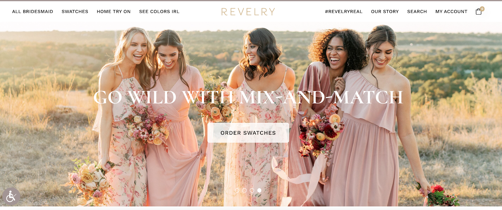
Revelry knows that swatches are the shortcut to any bride’s wallet when it comes to the bridesmaids’ dresses. As well as free sample delivery and at-home try-ons for the entire party. Both options have a prominent spot on the e-tailer’s homepage, along with excellent category navigation, prompting to discover different dress styles, materials, and colors.
4. Skullcandy
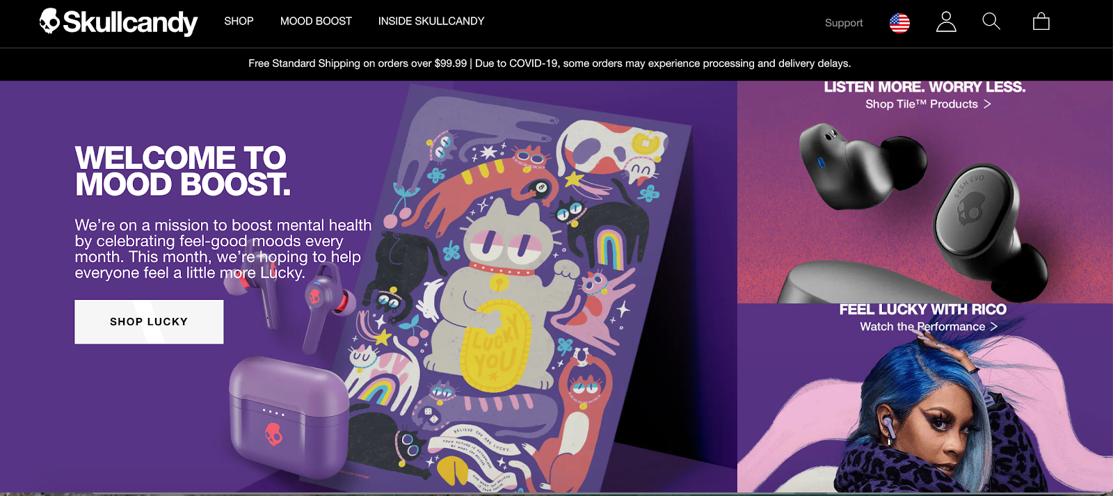
We rave about Skullcandy pretty often, but it’s hard to do better than this with an ecommerce store. They expertly offset bright colors with a signature black website design to create that sleek, lux feeling. Products are easy to discover, review in great detail on video, and then read on the specs. Though their primary market is audio, browsing Skullcandy’s website is a delightful sensory experience due to their expert use of visuals, material design elements, and video.
5. Solo stove
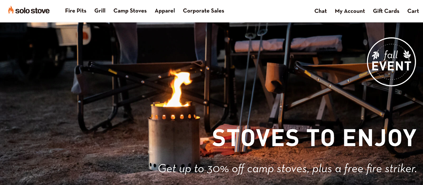
Solo Stove website is an admirable example of how to use iconography in ecommerce. The fire pit manufacturer made custom icons for each product category to better convey what they are selling and highlight some of the main product specs. How-to product videos, illustrations, and FAQ sections help bring across their main point further — their products are durable, easy-to-use, and well worth the price as the reviewers will tell.
6. Bliss
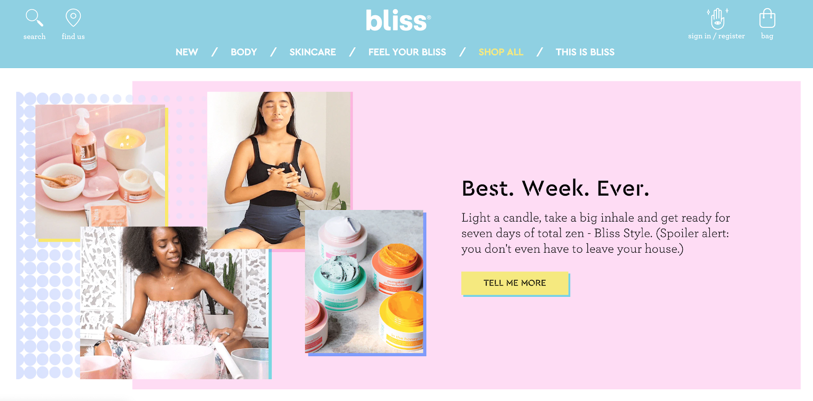
Bliss website is an absolute cotton eye-candy. The spa-powered skincare brand uses three dominant colors — Millennial pink, baby blue, and Gen Z yellow — to visually appeal to their main buyer personas. The funky and friendly brand attitude is further reinforced through microcopy. The wording of button copy, section titles, and form descriptions makes you feel as if you are talking about your skincare routine with a friend.
7. The Mountain
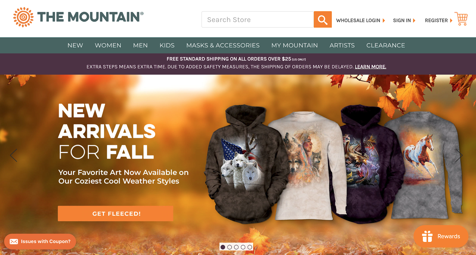
The Mountain has all the great design features of an ecommerce website. Straight forward navigation bar, featuring main product categories prompts exploration. Service banner, placed under the header, immediately informs about shipping terms and possible delays — a good practice for managing customer expectations.
The hero slider highlights the latest seasonal goodies and promos and prompts further discovery. With a wider range of product categories, The Mountain did an excellent design job of organizing everything in categories to reduce the feeling of overwhelm a lot of ecommerce platforms can give you.