8-Step Ecommerce Website Design Checklist

Even with the best-in-class tools, the design process can get easily derailed without a clear roadmap. What do you need to prepare for your e-store launch?
- Homepage.
- Category pages.
- Product landing pages.
- Checkout page.
- About us.
- Search bar and search results page.
- Account registration and login forms.
- Email subscription form.
Let’s tackle all of these one by one.
1. Homepage.
A homepage is the first touchpoint between you and a potential customer, you can think of it as a digital storefront for your online business. With roughly 3 seconds to make a good impression, you need to be strategic with your design choices on your homepage.
High-performing ecommerce homepages share the following elements:
- Clear set of product categories, either in the header or sidebar section.
- Hero image (or image slider) featuring the main product or current offers.
- Curated presentation of recommended products, trending items, or product categories.
- Enter and exit pop-up or sticky offers for retention.
The structure above is not cut and dry, though. The look of your homepage will be determined by two factors — your industry and your customers’ preferences.
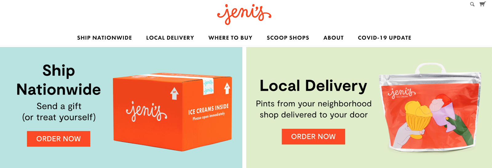
For example, Jeni’s ice cream immediately prompts the shoppers to decide if they want to order a takeaway from their local store or ship nationwide.
2. Category page.
Category pages help organize all your products and facilitate discovery. Digitally distracted customers want instant information, especially when they are on mobile devices. So you need to serve them with quick access to the products they crave.
Apart from being crucial for user experience, category pages also need to be optimized for SEO (search engine optimization). Incorrect parent-child relationships, can result in duplicate content and undercut your rankings in search results. Thus ensure that each category page:
- Has a descriptive, SEO-friendly URL.
- Features unique texts for category descriptions.
- Fits logically into your overall information architecture.
- Features additional filters for sorting product suggestions.
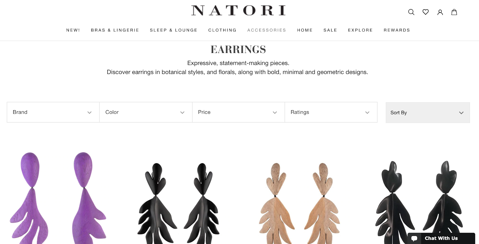
Natori follows all of these principles to create a delightful browsing experience for buyers:

3. Product page.
Product page design is exceptionally important for ecommerce. Whether you sell t-shirts or tires, if your listings look meh, your traffic and conversion numbers will never go up. At the very least, your product page has to feature:
- High quality product photo(s).
- Product specs: name, color, sizes, prices, key features.
- Buy and save for later buttons.
- Detailed product description.
- Social proof/customer reviews.
- Related products (upsells and cross-sells).
Then you can spice it up with some extra features — countdown timers, video or AR demos, check-in-store option, back-in-stoke alerts, and more! In our previous post, we talked a heap more about creating effective product pages.
4. Checkout page.
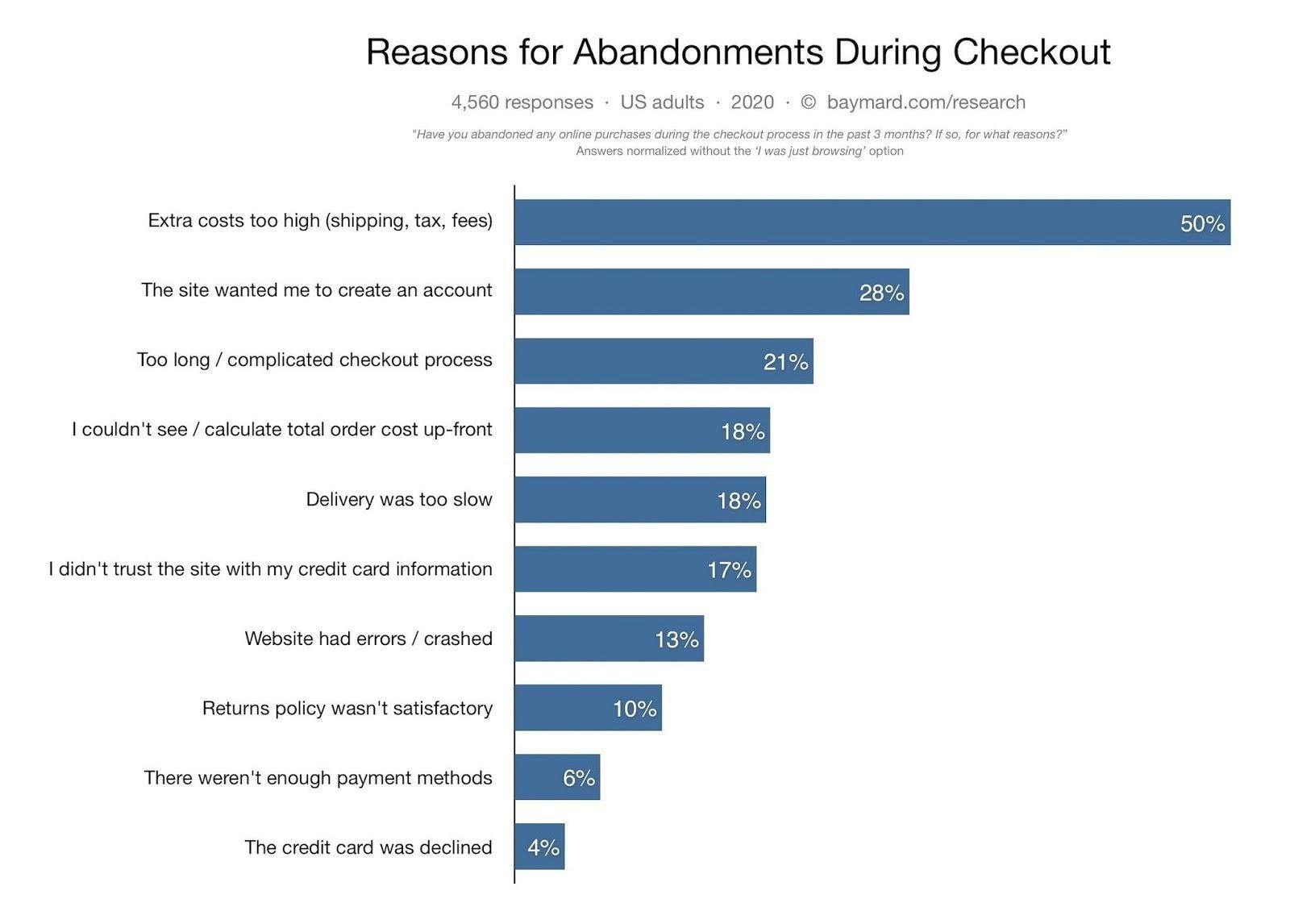
Many factors can prompt the customer to abandon their shopping cart, according to Baymard Institute:

Most of them can be prevented by improving your checkout page look and flow.
- Enable ‘guest checkout’ for first-time shoppers and prompt them to register an account with you after they’ve completed their purchase.
- Reduce the number of required form fields. On average ecommerce websites have 12.8 fields in the checkout flow. But you capture all the customer data you need within 6-to-8 fields.
- Clearly list all of the payment methods you accept (e.g. debit or credit card, Apple Pay, PayPal).
- Informing about all the possible costs pre-checkout. You can place a sticky banner informing visitors about the ‘free shipping’ threshold. Incorporate handling fees in the product pricing. Automatically apply relevant sales taxes pre-checkout.
5. About us page.
Don’t treat an “About” page as an afterthought, especially if you’re in B2B ecommerce. Because 52% of business buyers say one of the first things they want to see on the vendor website is the “About Us” page.
There are many ways to craft an attractive “About Us” page for an ecommerce company:
- Tell a story about your products.
- Introduce your team.
- Present your company values.
- Explain how you operate.
- Talk about your history.
- Or present your future vision.
Design-wise, keep the texts short and point. Avoid sales pitches and CTAs, but do use good team and product visuals to back up your story.
6. Search results page.
Larger ecommerce stores need to think well about the on-site search experience.
To create a great on-site search experience:
- Make the search bar easy to discover.
- Suggest auto-completes.
- Provide results for misspelled words.
- Personalize search results using analytics.
- Support image searches along with text queries.
7. Account registration & login forms.
Don’t brew too much over login forms. They should be short, progressive, and friction-less. Ask the shopper to provide the basic information first (email/pass) or even log in with one of their social accounts. Every extra step during registration increases the chances of churn. Request shipping and billing details after the registration is complete. Offer users an option to save and re-use their details in an address book — for everyone’s convenience.
8. Email newsletter form.
A well-executed ecommerce email marketing campaign can drive repeat traffic to your website and maximize conversions. But before you market, you need to build your email list. To entice subscriptions, give your newsletter a prominent placement at the homepage and keep a sticky or pop-up version in the footer area. To retain first-time shoppers, you can also pitch a small discount for a subscription.
Wrapping Up
Between conversion optimization, new product landing pages, and seasonal promotions, you’ll always have plenty of ‘design’ work at hand. But with functional and performance requirements taken out of the way by the leader for custom ecommerce websites, you can focus on growing your business.